
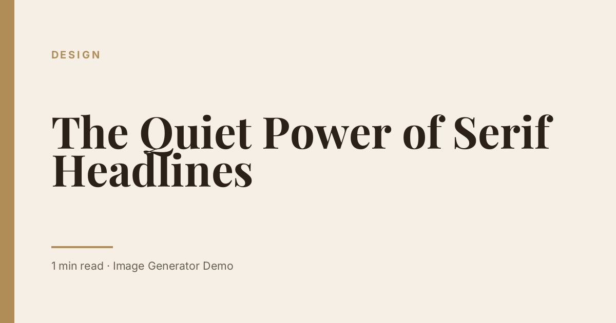
Scroll through any well-loved magazine and you will find the same thing: serif headlines that feel calm, confident and a little bit luxurious. The same effect works on the web, and especially on featured images.
Why serifs feel trustworthy
Serif letterforms carry centuries of printed history. Readers associate them with books, newspapers and long-form writing, so they lend authority to your title before a single word is read.
Pair with plenty of space
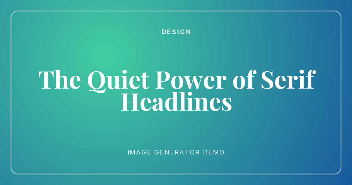
A serif headline needs room. Wide margins, a thin accent line and a soft background let the letterforms do the work.
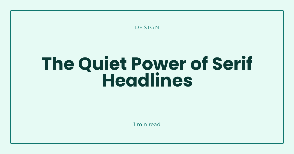
Try a cream background with a gold rule, or a mint frame with deep green type. Both feel editorial without any extra decoration.
Leave a Reply